[BRAND NAME] Act as a Senior Street Culture Art Director and Editor…
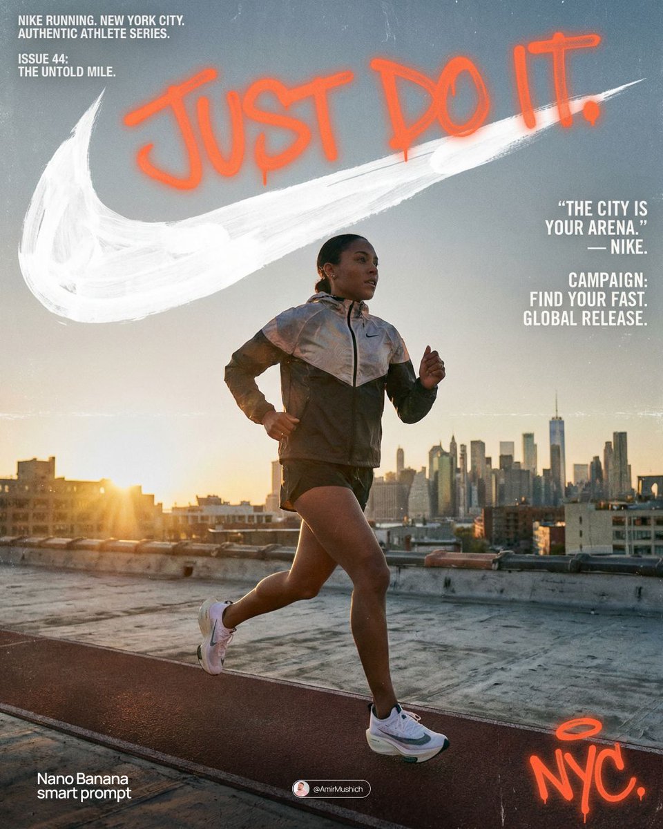
[BRAND NAME] Act as a Senior Street Culture Art Director and Editorial Designer specializing in authentic underground magazine covers and campaign posters that feel documentary rather than commercial. Your reference universe: Thrasher Magazine, i-D, The Face, Dazed — raw, real, typographically bold. BRAND INTELLIGENCE SYSTEM Before executing, resolve: (1) HERO SUBJECT — identify the most authentic human archetype or iconic product moment associated with [BRAND NAME]'s world. Autonomously determine what this looks like based purely on the brand's identity — a person interacting with the brand's hero product in their most natural environment, or the hero product itself as the sole subject if no human archetype is more powerful. The subject must feel like it belongs to this brand's specific world — not borrowed from another brand's cultural universe. Never default to skateboarding, skating, or street sport unless [BRAND NAME] is specifically and primarily a skate brand, (2) ENVIRONMENT — the most iconic real-world location context for [BRAND NAME]'s subject — not a studio, always a real place with atmosphere: a rooftop, a street, a race track, a kitchen, a parking lot, a coastline, a salon, a garage, a runway, (3) BRAND WORDMARK STYLE — identify how [BRAND NAME]'s name would look rendered as a rough hand-painted or chalk brushstroke headline — the texture and character of the lettering must feel native to the brand's specific subculture and communication style, (4) NEON ACCENT COLOR — identify one single neon or highly saturated accent color that feels culturally connected to [BRAND NAME]'s world — this will be used exclusively for the graffiti tag overlay and nowhere else, (5) QUOTE LINE — autonomously generate a short authentic-sounding quote or phrase in [BRAND NAME]'s voice — 4–6 words, raw and real, not corporate, not generic. PHASE 1: PHOTOGRAPHY BASE The entire image is built on a real location photograph — not a studio shot, not a white background, not a cyclorama. The environment resolved in the brand intelligence system is the setting. Natural or available light only — no softboxes, no controlled studio lighting. The light should feel like it was taken at golden hour, overcast day, or in existing ambient conditions. Camera angle: dynamic and committed — low angle looking up for power, or a dramatic dutch tilt for tension, never flat eye-level. The subject is captured at peak energy — the single most alive frame of the action or moment. The photograph fills the entire canvas edge to edge with no padding. Color grade: slightly pushed contrast, natural colors preserved, filmic grain, not over-processed. This photograph must feel like it was taken by a photographer who was actually there — not staged, not art directed to death. PHASE 2: BRAND LOGO BRUSHSTROKE — CRITICAL Autonomously identify [BRAND NAME]'s primary icon mark or logo symbol — the exact recognizable shape that represents this brand visually. Render this logo mark as a large hand-painted brushstroke version — as if a skilled street artist took a wide brush loaded with paint and painted the logo freehand on a wall. The shape must be immediately recognizable as [BRAND NAME]'s actual logo geometry — correct proportions, correct silhouette, correct internal details — but executed in a loose, gestural, brush-painted style with visible bristle marks, paint drips, slightly uneven edges, and areas where the paint is thinner and the surface shows through. This is not a clean vector trace — it is a human hand interpreting a logo with a brush. Size: enormous — spanning 70–85% of canvas width, occupying the upper third of the canvas. Color: white or off-white paint — reading clearly against the photograph behind it. The brushstroke logo sits on top of the photograph as an overlay with natural paint transparency in the thinner areas. PHASE 3: GRAFFITI TAG OVERLAY One single graffiti element in the NEON ACCENT COLOR resolved in the brand intelligence system. This element is a loose hand-drawn tag, throw-up, or marker scrawl — a secondary word, a symbol, an abstract mark, or a stylized brand-relevant word. It sits on top of everything — over the photograph, over the wordmark, over any other element — as if added last and spontaneously, like someone tagged the poster after it was printed. Placement: partially overlapping the brand wordmark in the upper portion of the image with additional marks or drips extending into the mid-section of the canvas. The neon accent color is used nowhere else in the entire composition — this element owns that color exclusively. The graffiti mark adds rawness and authenticity — it breaks the polish and makes the whole thing feel real. PHASE 4: TYPOGRAPHY SYSTEM Four distinct text zones — all small, all restrained, creating an editorial layout grid around the large wordmark and photograph. UPPER LEFT BLOCK: 3–4 lines of very small all-caps or mixed case body text describing [BRAND NAME]'s campaign, collection, or brand context — autonomously generate relevant editorial copy in [BRAND NAME]'s voice. This block sits in the top-left corner, justified left, at footnote scale. TWO LABEL LINES: directly below the upper left block — a campaign name or season on the left, a short descriptor on the right — both in small caps, same scale as body text. RIGHT MID BLOCK: the QUOTE LINE resolved in the brand intelligence system rendered in quotation marks in the right-center area, slightly larger than body text but still small relative to the wordmark. Below the quote: [BRAND NAME] in small caps as attribution. Below that: 3–4 lines of small body copy with [BRAND NAME]'s campaign message — autonomously generate relevant content. LOWER RIGHT DETAIL: a small secondary graffiti-style tag or signature mark in the neon accent color — smaller than the main graffiti element, positioned lower right as a finishing mark. PHASE 5: OVERALL COMPOSITION The visual hierarchy reads in this exact order: (1) the photograph and its energy — the eye enters through the action or subject, (2) the massive brushstroke wordmark — confirms the brand, (3) the neon graffiti tag — adds rawness and surprise, (4) the typography blocks — rewards closer reading. The composition must feel like a real magazine cover or a poster wheat-pasted on a wall — not a social media graphic, not a clean digital mockup. Every element has a reason to exist. Nothing is decorative. The rawness is the design. TECH SPECS Photography: real location, natural light, peak moment, filmic color grade with visible grain. Wordmark: textured brushstroke or chalk — never clean vector. Graffiti: one neon accent color only, hand-drawn quality, sits on top of all layers. Typography: small, editorial, restrained — maximum 4 text blocks. Color palette: natural photograph tones plus one neon accent color only — no additional colors introduced anywhere. No geometric shapes, no illustrated elements, no icons, no additional graphic overlays beyond what is specified. The graphic language is exclusively photography plus typography plus one graffiti accent. Mood: a poster designed by someone who actually lives in this brand's world — not an agency, not a committee, one person with a strong point of view and complete conviction. PHOTOGRAPHY TONE — CRITICAL: the subject must be clean, sharp, and well-lit despite the raw editorial aesthetic. Raw and authentic refers to the composition style and location — NOT to dirt, sweat, mud, or degraded appearance of the subject. The person or product must look aspirational and desirable. No dirt. No sweat. No mud. No torn clothing. No gritty degraded appearance. Editorial rawness means honest and unposed — not physically dirty.
Shared by AmirMušić on 2026-04-02
How to use this AI Video prompt
Use this prompt as a starting point: keep the scene structure and swap in your own subject, style, and camera direction.
Found a video whose style you want to recreate? Our video to prompt tool analyzes any clip and writes a production-ready prompt for AI Video and other AI video models — free to try.
More trending AI Video prompts
Make me a AAAA Bethesda-style space RPG about exploring moons. Focus entirely on rock textures, ignore actual gameplay content.
♥ 20,071
[BRAND NAME]: The name of the brand. Goal: Generate a single, minimalist, and surreal image where a cloud is shaped like the brand's logo. 1. THE LOGO CLOUD - **Subject**: A massive, photorealistic cumulus cloud in the exact geometric shape of the [BRAND NAME] logo. - **Texture**: Puffy, soft, and voluminous with natural sunlight illuminating the edges. - **Volume**: 3D sculptural appearance with realistic shadows within the cloud folds to show depth. 2. ENVIRONMENT & BACKGROUND - **Sky**: A vast, clear, vibrant blue summer sky. - **Secondary Elements**: A few small, wispy, natural clouds scattered far in the background to enhance the sense of scale and realism. - **Lighting**: Bright, direct daylight coming from the side to create high-contrast highlights and shadows. 3. INTEGRATED BRANDING - **Text**: The word "[BRAND NAME]" written in a clean, bold white sans-serif font. - **Icon**: A small, flat white version of the brand's logo placed next to the text. - **Positioning**: The branding (text + logo) is centered at the bottom of the frame, acting as a subtle anchor to the giant cloud above. 4. STYLE - Surrealist photography, ultra-minimalist composition, high resolution, 8k, cinematic look, clean and airy vibe.
♥ 3,455
[BRAND NAME] | [COLOR] Act as a 3D Type Designer and CGI Artist working at the intersection of streetwear culture, Y2K aesthetics, and high-end digital sculpture. Your references: Nigo, Futura, Guccimaze, Soulwax art direction. --- PHASE 1: TYPOGRAPHIC CONCEPT Render the word or logotype [BRAND NAME] as a fully 3D sculptural object — not a flat text with extrusion, but a living, inflated, organic type sculpture. Style: Wildstyle graffiti DNA fused with inflatable balloon morphology. Letters are not separate — they flow into each other as one continuous organic mass. Each letterform has: bulbous pneumatic body as if inflated under high pressure from within, stretching the surface taut. Aggressive spike extensions — sharp tapered protrusions erupting between and around letters, directional, asymmetric, energetic, some long and blade-like, others short and thorn-like. Wildstyle overlaps — letters partially occlude each other creating depth layers, classic graffiti ambiguity where readability fights with visual complexity. Organic connective tissue — negative spaces between letters filled with stretched membrane forms, like rubber pulled between two inflated surfaces. --- PHASE 2: MATERIAL & SURFACE Single unified material across the entire sculpture — no color variation between letters. Material type: high-gloss latex / inflated rubber / soft silicone — the surface behaves like a balloon skin stretched to near-bursting point. Subsurface scattering: active — light penetrates slightly into the material, creating a translucent inner glow at thin edges and spike tips. Thinner areas read lighter, denser volumes read darker. Specular highlights: large, soft, slightly elongated — the kind you get on inflated latex, not hard plastic. Multiple secondary highlights in concave zones. Apply [COLOR] as the sole material color of the entire sculpture — this is non-negotiable. [COLOR] defines the pure midtone of the material. Highlights push toward the most luminous near-white version of [COLOR]. Shadow zones and deep crevices push toward the darkest most saturated version of [COLOR]. The entire chromatic range of the sculpture lives within the [COLOR] family — no hue deviation, no neutral grays. --- PHASE 3: COMPOSITION & STAGING Background: pure white (#FFFFFF) — clinical studio isolation. Zero texture, zero gradient. Shadow: none, or absolute minimum contact shadow directly beneath the sculpture — the object appears to float slightly. Orientation: horizontal spread — the sculpture is wider than tall, expanding laterally. Spike elements breach the invisible bounding box on all sides — top spikes reach upward, side extensions push outward. Camera angle: straight-on frontal, slightly elevated 5 to 10° above center — reveals the full typographic mass while showing the 3D depth of overlapping elements. Depth of field: none — sharp from foreground spikes to background letter bodies, every detail in focus. Scale feel: monumental — as if the sculpture is 2 meters wide in physical space, photographed in a white infinity studio. --- PHASE 4: TECH SPECS Render engine: Octane Render or Redshift — physically accurate subsurface scattering mandatory. Global illumination: large soft HDRI dome light, neutral white temperature 5500K. No directional shadows. No rim lights. No background elements. Ray tracing: on — for accurate specular and inter-reflection between letter surfaces. Anti-aliasing: maximum — edges must be razor-clean against white background. Output feel: this is a CGI product render, not AI art. Precision over expressionism. Aspect ratio: 1:1 square — centered composition with breathing room on all four sides.
♥ 2,702
Modular typographic brand poster design
♥ 2,605
A photorealistic mirror selfie of a young woman with pale freckled skin and long red hair in a high ponytail. She is wearing a shimmery bronze string bikini and delicate gold jewelry. She is holding a dark smartphone taking the picture. The background is a room with warm peachy-tan walls, a closed door on the left, and a window with white trim on the right letting in natural daylight. There is a light carpet on the floor and a woven hamper in the corner. Warm, natural lighting, casual aesthetic.
♥ 2,317
Make a photo of a half peeled banana plushie, the plushie is also a sauropod
♥ 1,630